HERSHOP
E-COMMERCE MIGRATION / REDESIGN / DEVELOPMENT
A complete e-commerce transformation for HERSHOP, covering migration, visual redesign, UX improvements, responsive development and custom storefront features.
A complete ecommerce transformation.
A complete e-commerce transformation for HERSHOP, covering migration, visual redesign, UX improvements, responsive development and custom storefront features.
- Migration
- Shopify implementation
- Experience
- Storefront redesign
- Development
- Custom responsive features
- UX
- Discovery, support and clarity
Fashion contrast, built into the interface.
#171313The grounding contrast that lets product imagery lead.
#6D0B1CThe fashion-led brand field for focus, warmth and recognition.
#9A2036Labels, active states and commercial moments that need energy.
#C9B8A6A tactile neutral that keeps the storefront premium and human.
#E8DED8Light sections, readable text and visual breathing space.
#080808Deep contrast for supporting UI, footer areas and utility layers.
#4F783BThe SHOP signature for brand recognition, active moments and confident commerce cues.
The storefront, unfolded as a visual system.
Each screen is visual proof of the design and development decisions made across the customer journey.
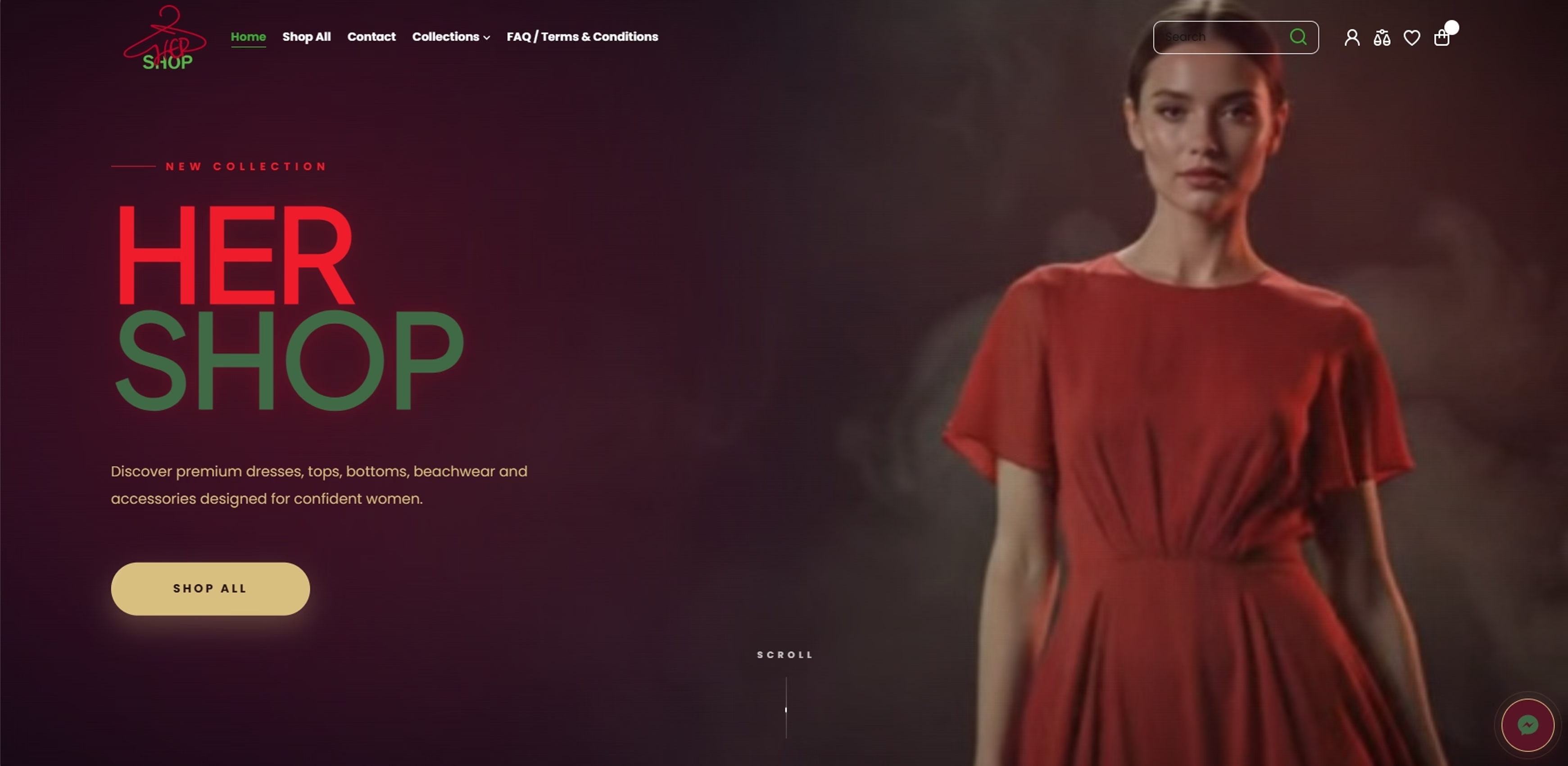
A Cinematic First Impression
- Created a custom full-width cinematic hero direction
- Built a strong visual hierarchy around the HER SHOP headline
- Added a clear Shop All call to action
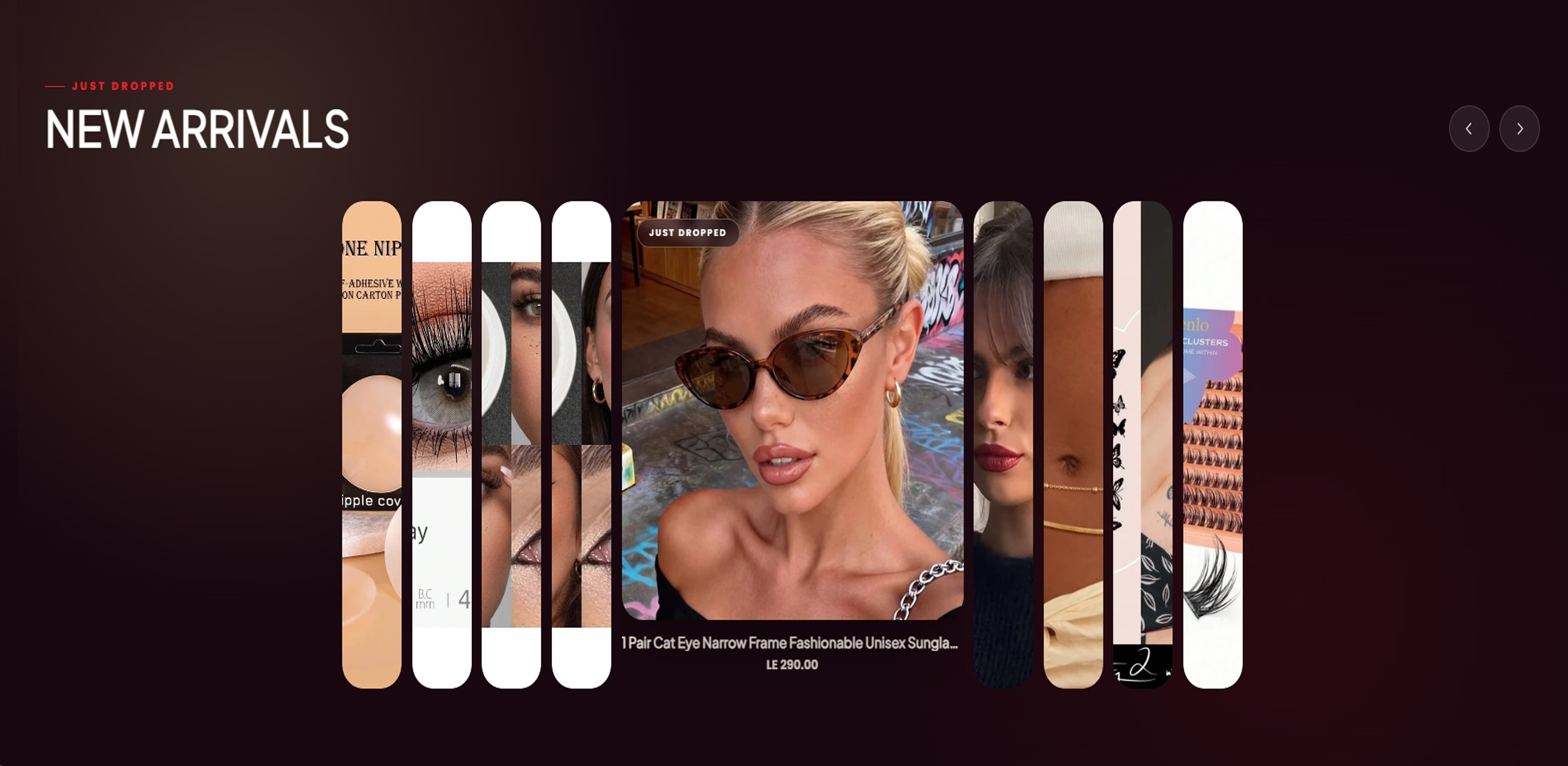
A More Dynamic Way to Discover New Products
- Built a custom horizontal product carousel experience
- Created a large focused active product card
- Improved product discovery without a standard grid
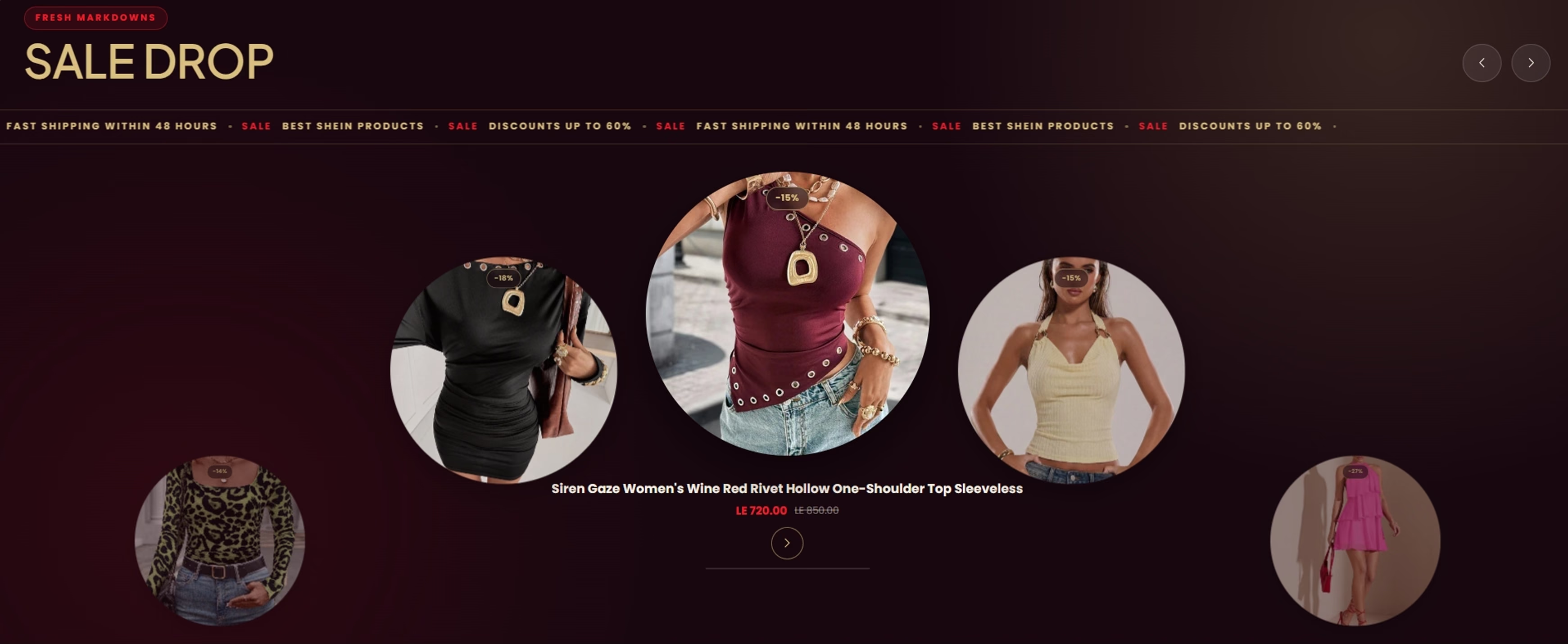
Making Sale Products Feel Like a Campaign
- Created a wheel-style promotional carousel
- Highlighted the selected product in the center
- Added a promotional ticker
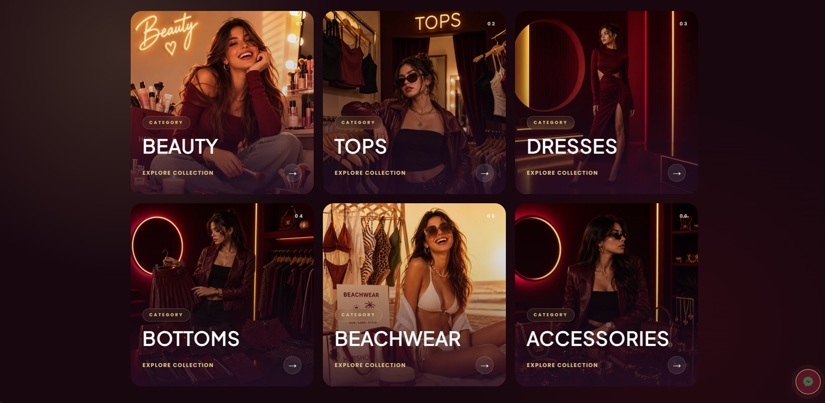
Category Browsing, Reframed as Editorial Content
- Designed six large category cards
- Added category labels, numbering and directional CTAs
- Built a responsive discovery grid
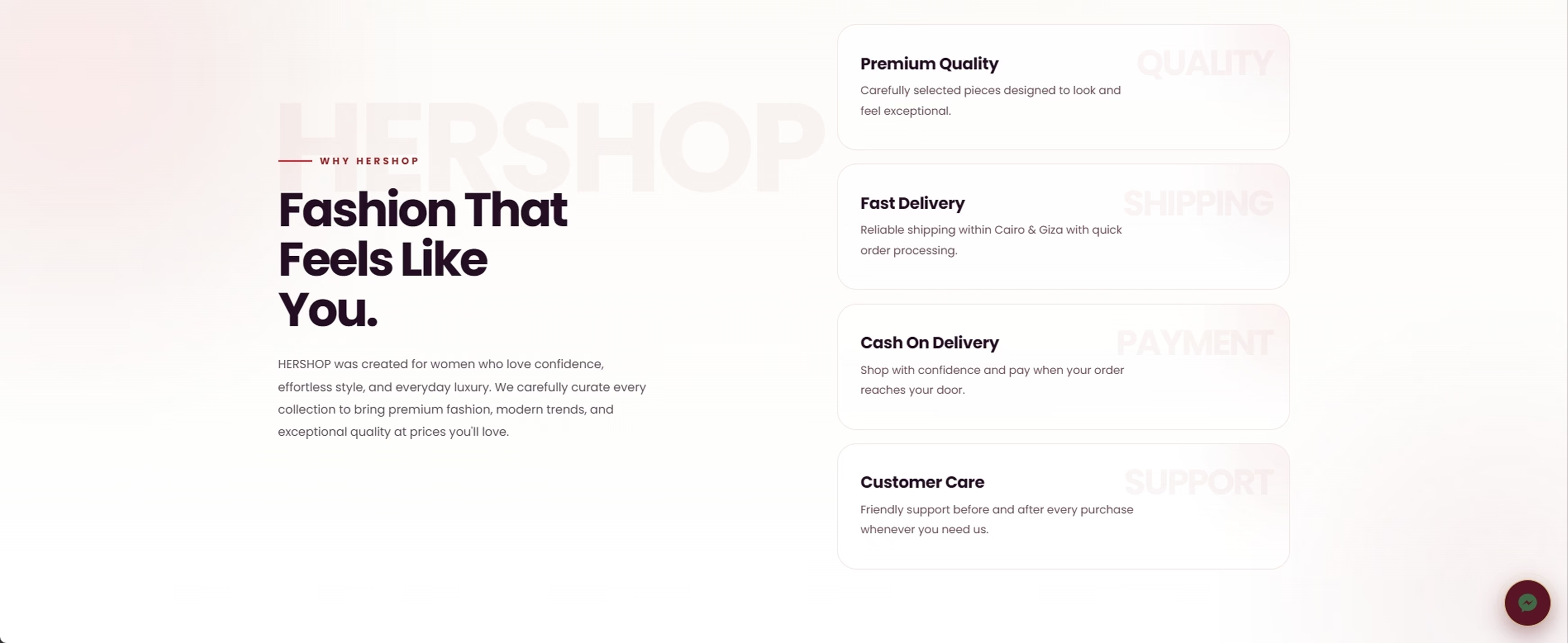
Turning Brand Values Into a Shopping Experience
- Designed a split editorial layout
- Created service and value cards
- Balanced a light premium section against darker sections
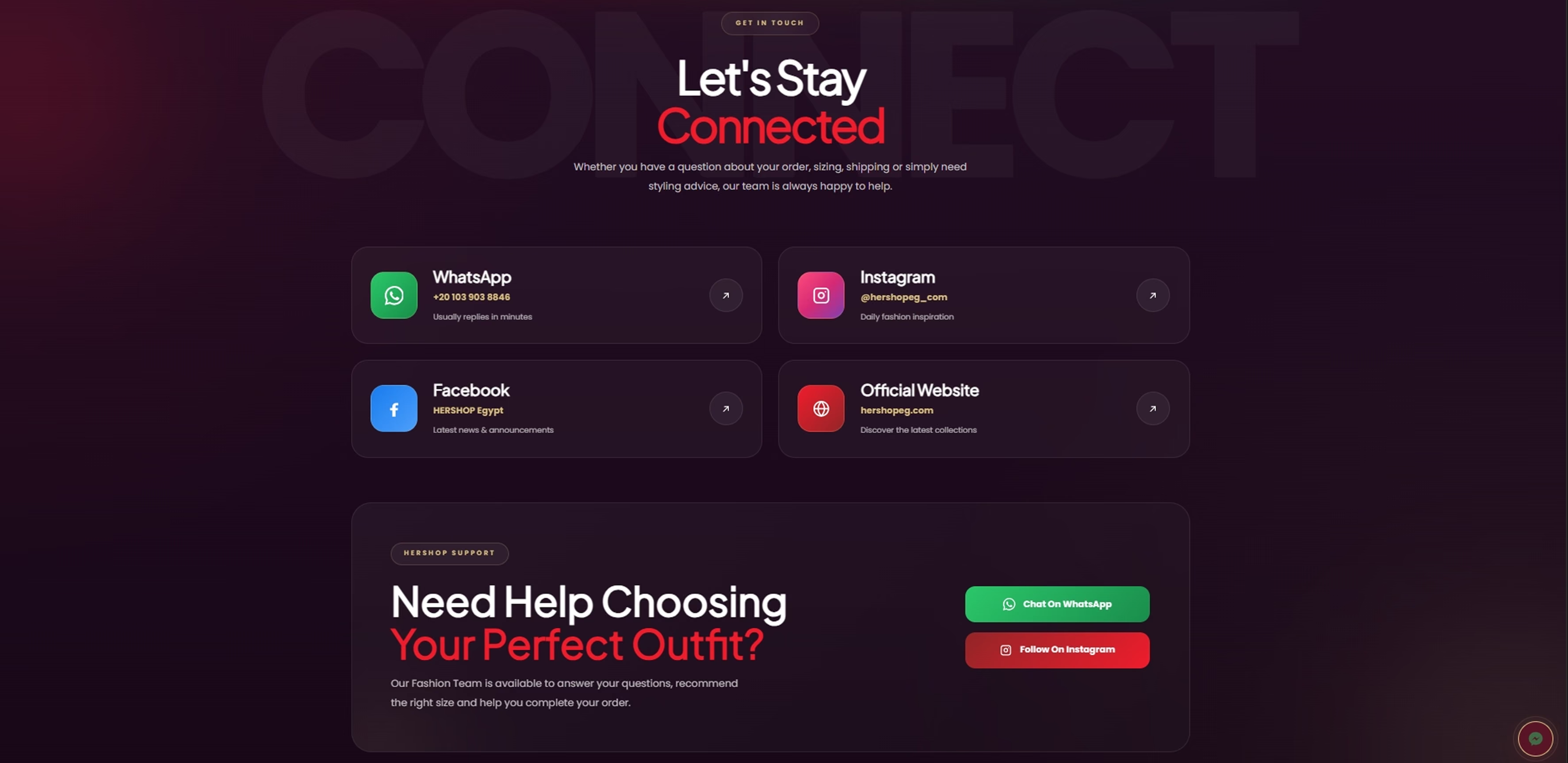
Support Designed as Part of the Storefront
- Created dedicated contact channel cards
- Added clear channel-specific calls to action
- Made support easier to discover
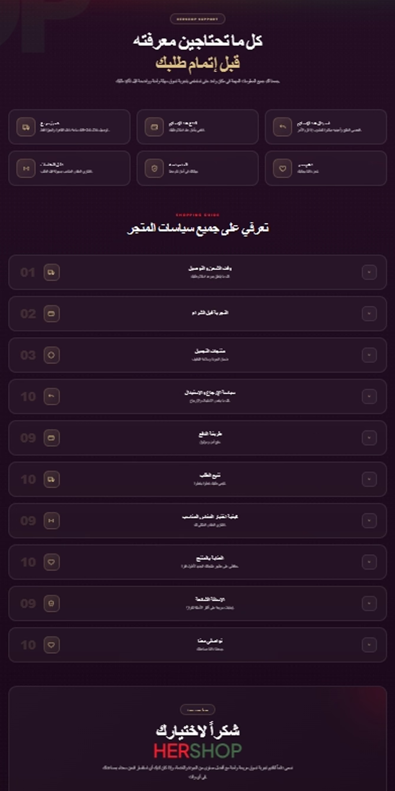
Reducing Friction Before Checkout
- Designed an Arabic support and FAQ layout
- Created an accordion-style policy section
- Covered ordering, payment, shipping and returns
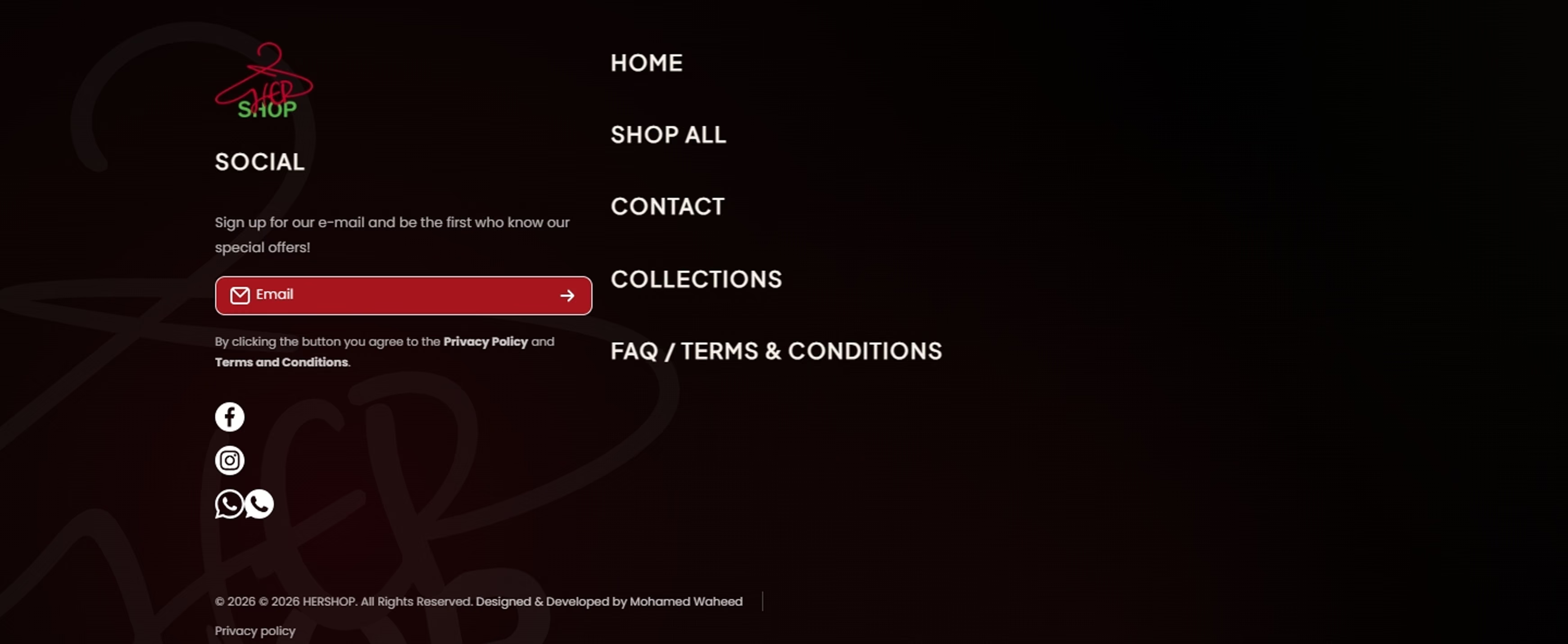
A Footer That Works as a Final Navigation Layer
- Integrated the HERSHOP logo and watermark
- Organized primary store navigation
- Added social, WhatsApp, privacy and terms access
Catalog scale, made easier to enter.
Every screen is part of the shopping system: discovery, trust, support and the final decision.
One visual system. Two considered experiences.
Responsive Behavior Across Desktop Screens
Desktop responsiveness was tested and refined so the visual hierarchy, custom sections and interactions remain balanced across different screen sizes.
The Same Visual System, Rebuilt for Mobile
The mobile experience was treated as a dedicated layout rather than a scaled-down desktop version, preserving clarity and usability on smaller screens.