1
First impression
The gift box and mug lead. The brand name is the headline.
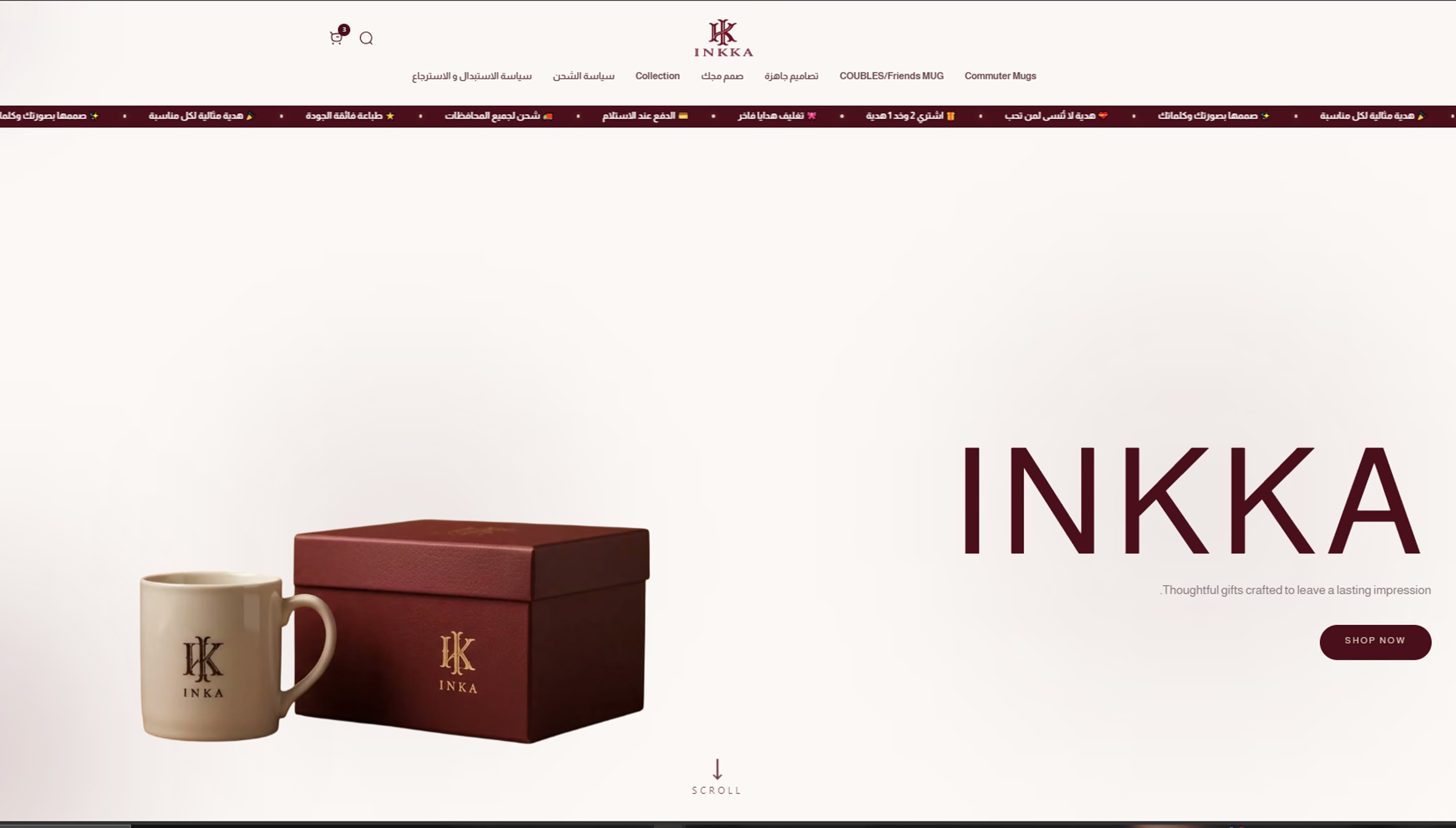
A personalized mug store, rebuilt as a gifting ritual, felt long before the lid lifts.
 EasyOrder
A mug and a wine-red box on ivory, one button. Nothing sits between the visitor and the gift.
Pick a ready design or send your own words and photo. The choice lives on the first screens, not inside a product page.
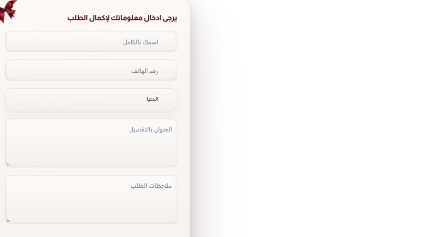
A short order form, cash on delivery and a WhatsApp button that is always within reach.
Four colors taken from gift packaging. Hover a color to read its job.
#FBF8F5Paper-like space that lets the product breathe.
#5A0E1EThe signature accent: emotion, depth and every main button.
#B98C8BA human warmth that keeps luxury from feeling cold.
#272321Copy, navigation and focus on the product.
The gift box and mug lead. The brand name is the headline.
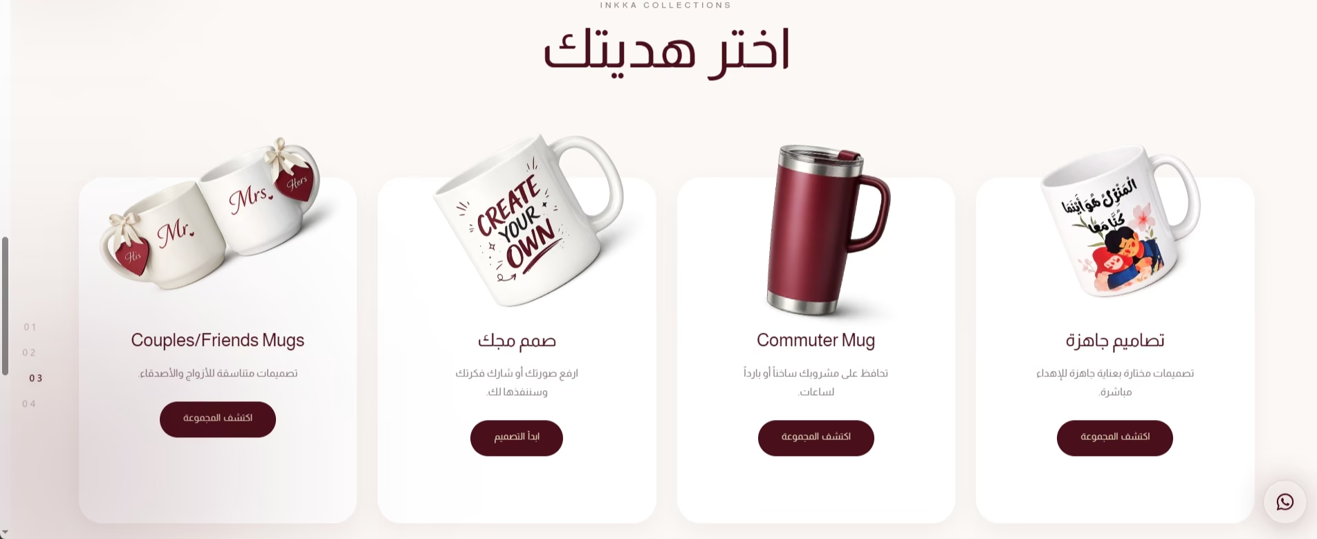
Four paths in one row: couples, custom, commuter and ready designs.
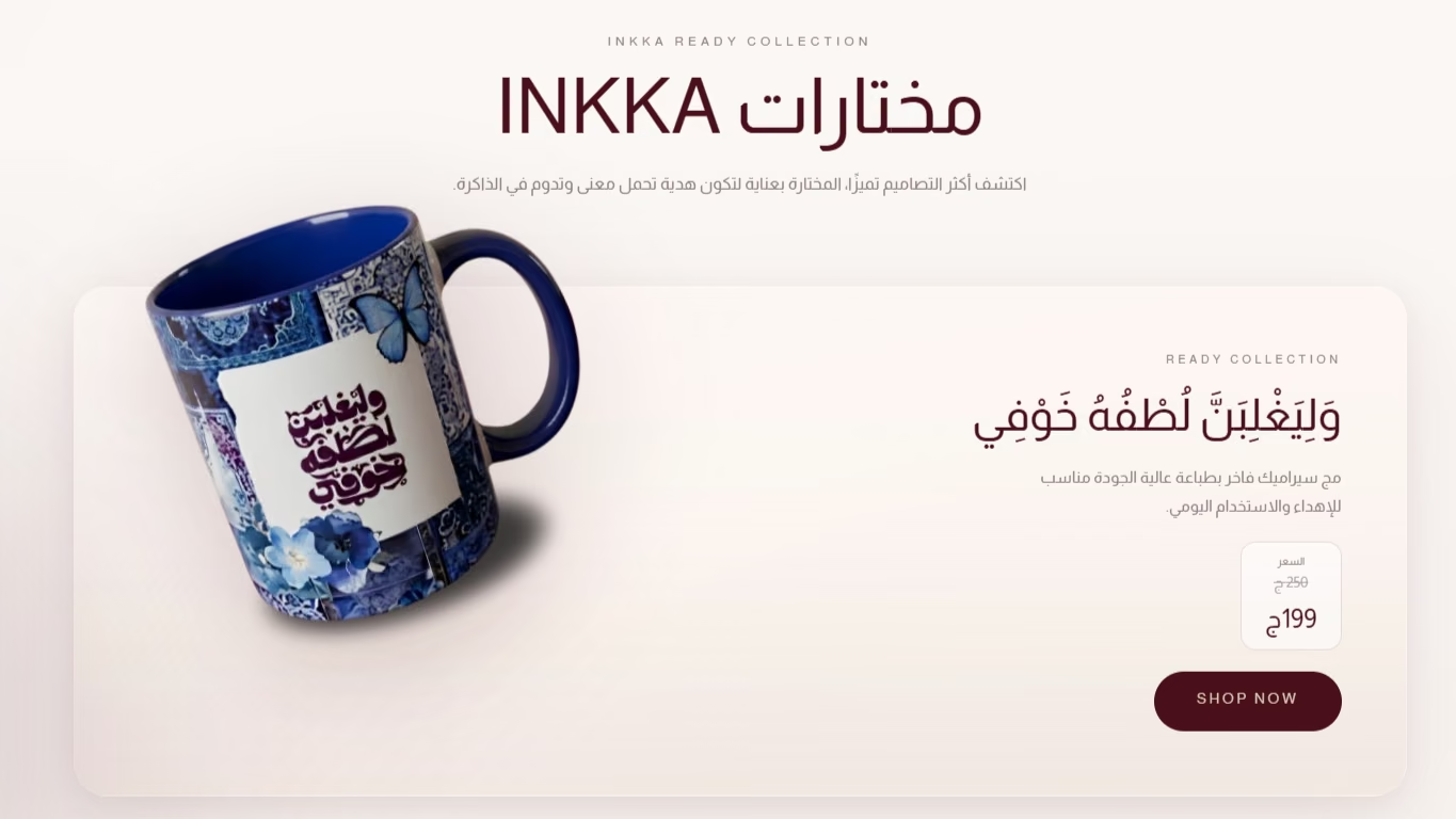
One featured design at a time, with its price and one clear action.
Five fields only, short enough to finish on a phone.
The monogram closes the story and links to every channel.
Desktop: wide composition, product first, clear personalization steps.
Phone: one column, big tap targets, a vertical story.
The store runs on EasyOrder for products, orders and checkout. I designed and built the experience layer on top of it.
EasyOrder